Reducing cloud infrastructure cost through design
The setup
Cinema chains and individual theatres have a content inbox on Qube Wire. Every week, they're tracking what movies are arriving and whether everything they need is there.
A movie delivery has two parts: the encrypted video files (called a DCP) and the decryption key (called a KDM). Both have to arrive for the movie to play. So projectionists and operations teams are constantly checking: do I have the content? Do I have the key? What's the status?
Simple question. The old answer was anything but simple.
The problem
The inbox showed a list of all movies, sorted by most recent update. Deliveries were grouped by movie, then by version (2D, 3D, Atmos, etc.), then by theatre. Each level displayed content and key status.
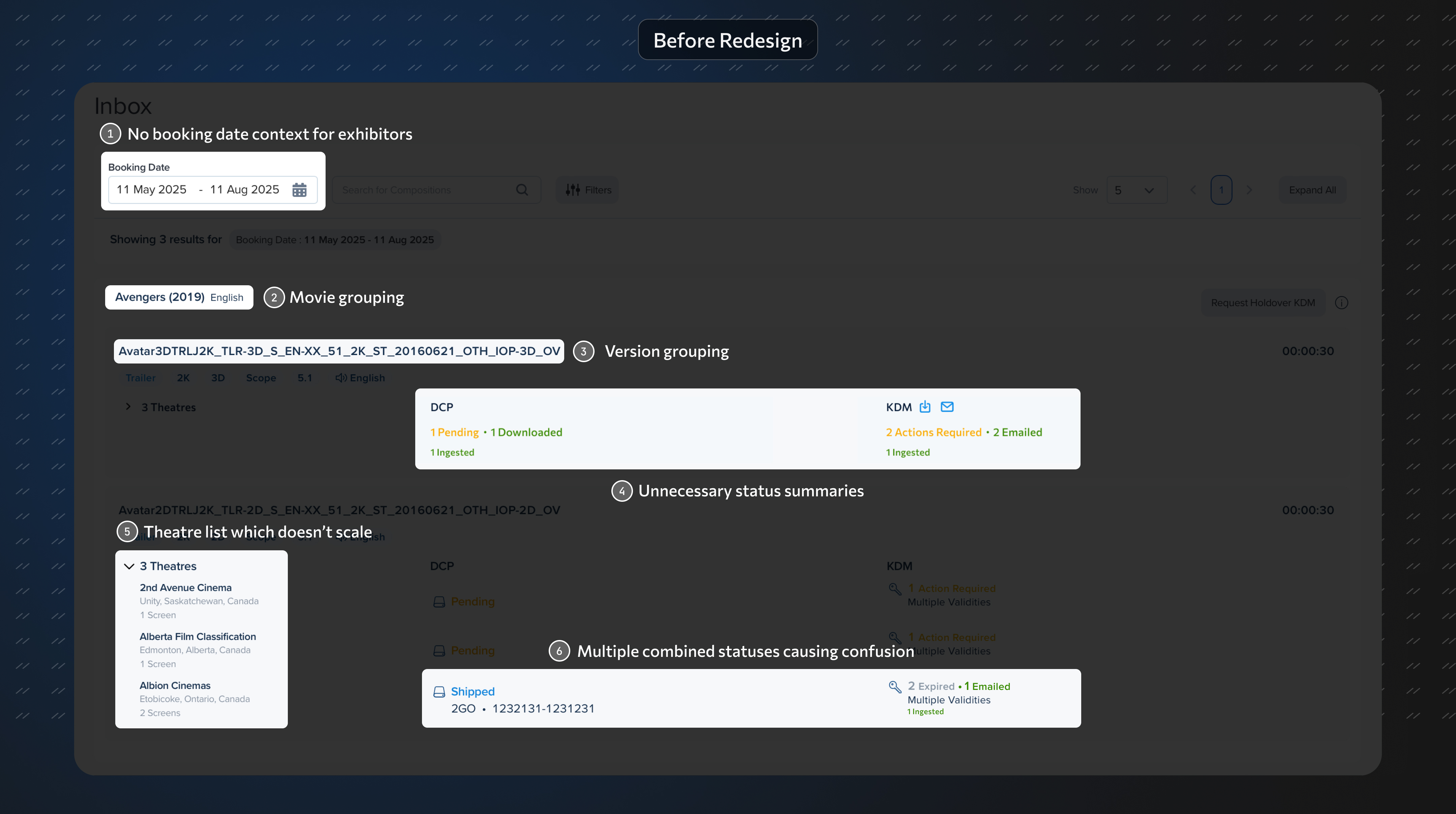
For a small independent theatre, this was clunky. For a chain like PVR with hundreds of screens, it was a disaster. Rendering this view was computationally expensive, driving up AWS indexing and compute costs. Search and filtering were slow, expensive and confusing.
Users did not complain. They liked the interface. But my gut feel was that they didn't know about the data clarity that they were missing.
The interface was trying to group and show everything at once. That decision was costing real money on the infrastructure side and real time on the user side.
Going deeper than the UI
I didn't just look at the interface. I dug into the entire engineering architecture to understand what was causing the high compute and indexing costs. That meant sitting with engineers, understanding how data was being stored and queried, and figuring out where the structural problem actually lived.
The insight: the cost problem and the usability problem had the same root cause. The system was computing and rendering relationships between every movie, every format, and every theatre all at once. Fix the information hierarchy and you fix both.
What I designed
I interviewed users (internal teams and external theatre operators) to understand how they actually work. The pattern was clear: people think in terms of one movie at a time. They pick a movie, then check what's happening with it.
I restructured the entire information hierarchy around that workflow and proposed a new data structure to match:
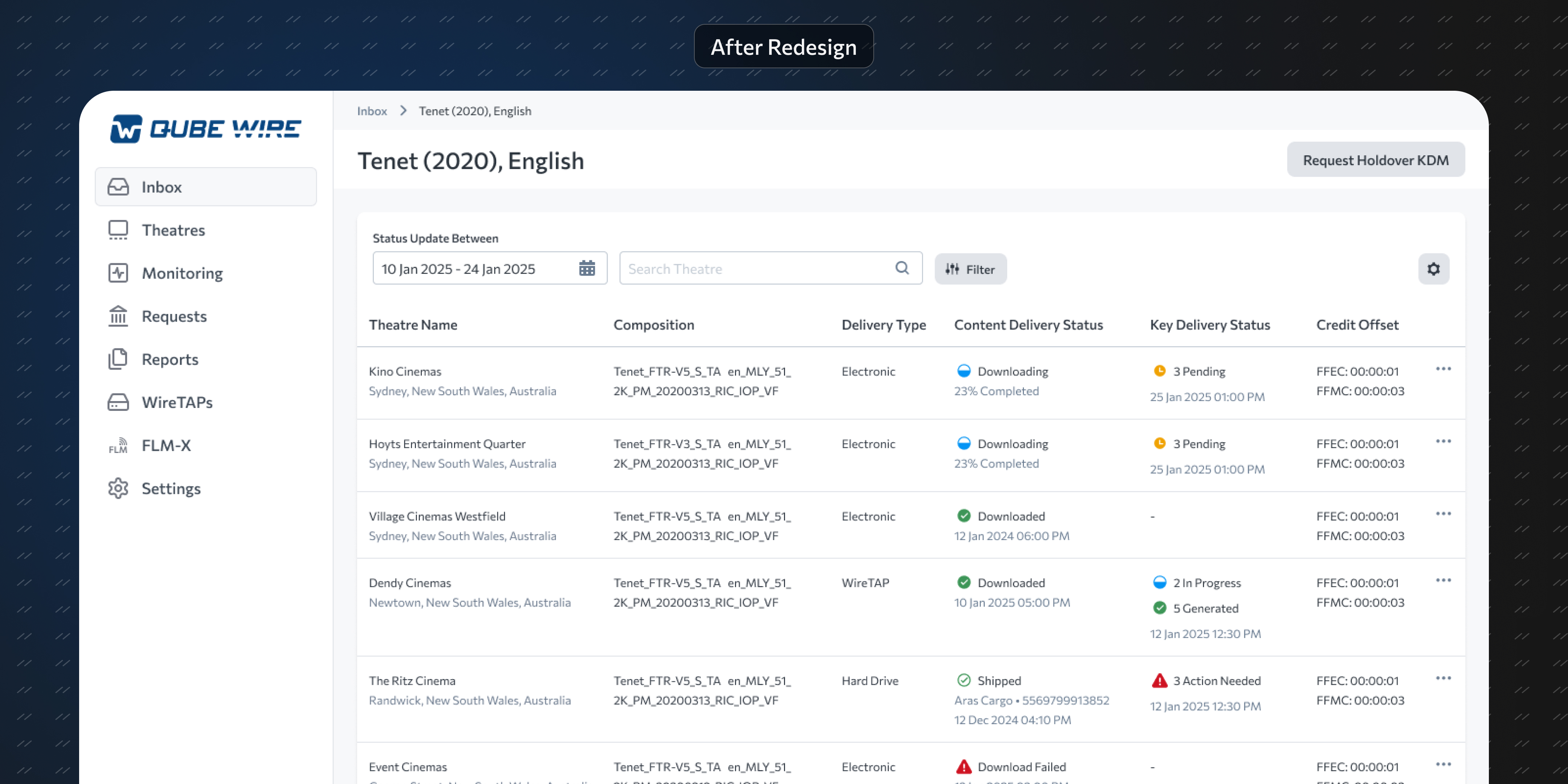
First level: A list of this week's movies. Pick one.
Second level: A table showing all versions of that movie and their delivery status across theatres. Clean, searchable, filterable.
I also built a theatres-first view for users who manage a single location and want to see all incoming movies at once.
By showing only the most recent content and key status for each movie-theatre combination, the data load dropped dramatically. Edge cases like multiple delivery attempts, which were nightmares in the old design, became straightforward.
What I got wrong first
Early on, I tested a prototype that stripped out all grouping. Just a flat table, assuming users would filter themselves.
It failed. I'd removed the structure users relied on without constraining the data volume. Users were staring at an ocean of rows with no anchor.
That test taught me something I keep coming back to: simplification isn't removal. I needed to add a layer of abstraction (the movie selection step) to actually make things simpler. The final design has more steps but feels lighter, because each step shows only what matters.
Results
- 65% reduction in AWS indexing and compute costs
- 30% reduction in time for theatres to find the status they need
- A design that scales cleanly from a single-screen theatre to a 500-screen chain